Role: Creative Director, Campaign Strategist
Project: Creative Direction, UI/UX Design, Email Design, Campaign Strategy
A print campaign celebrating two of Hershey’s core brand truths: simplicity, and an unwavering legacy over the past 100+ years.
As the Creative Director for both art and copy, I used straightforward photography and tight, witty headlines (never more than 12 words) to position the iconic Hershey bar as more American than the most stereotypically American things.
Minimal. Clever. Instantly recognizable. Just like the product itself.
Deliverables
Print Design
Project
Creative Direction, Art Direction, Photography, Copywriting
Soft Replenishment Email Series
To drive retention and re-engage our most active customers, I led the design and copy for a soft replenishment email series rooted in CRM-driven purchase behavior. The goal? Light-touch, high-impact nudges that remind users to re-order pods before their usual cycle ends, while also tempting them with personalized recommendations.
Tone was everything. I stayed true to the brand’s clever and conversational voice by layering in subtle jokes, cheeky phrasing, and bar-lingo nods that felt tailor-made for our home bar enthusiasts. Every line of copy aimed to sound like a knowing wink from their favorite bartender.
Visually, I developed a modular system within the brand’s design identity, allowing future sends to flex based on timing, product availability, and evolving seasonal strategies. Every element from layout hierarchy to CTA language was built with repeatability and clarity in mind.
This initiative targeted home bar owners who had purchased at least two orders, with the goal of increasing win back metrics. Through friendly cadence, smart segmentation, and personality-forward messaging, we turned a functional reminder into a delightful moment.
Deliverables
Email journey, modular design system, copy
Project
Art Direction, Copywriting, Modular Email Design System
Deliverables
Email Template Design System, Copywriting, Email Design, Landing Page Design System
Project
Creative Direction, Copywriting, Art Direction, Consulting Leadership, Project Management
This project was a full teardown and rebuild for the new Bob Evans Grocery corporate website. I was approached to freelance for an agency to start from scratch with a clean slate and a clearer strategy.
The new site was designed to unify the entire Bob Evans family of brands under one cohesive digital umbrella: Bob Evans, Simply Potatoes, Egg Beaters, Owen’s, Abbotsford Farms, Better'n Eggs, and Davidson’s Safest Choice Eggs. That meant one streamlined experience; visually, technically, and structurally while still maintaining the unique integrity of each brand.
I approached the UX and visual design with scalability and modularity in mind, building out a flexible design system that could support both template-based pages via ACF and custom block layouts for more dynamic content like the homepage. Every design decision was rooted in the principle of reuse: shared layouts, repeatable blocks, and smart component design to keep the build lean and sustainable.
Accessibility was non-negotiable. Each element including color palettes and CTAs was run through ADA compliance checkers to ensure the final experience met WCAG standards. (Bonus: yes, I used a checker before sending files over.)
More than a redesign, this was a strategic re-platforming built to grow, built to unify, and built to meet users where they are for the future of Bob Evans.
Deliverables
Design files and prototypes to developer team
Project
Agency Partnership, UX/UI Design, Strategy, Accessibility
Welcome Series Redesign
As Art Director, I led the relaunch of Bon-Ton’s welcome email program, reimagining both the acquisition strategy and the creative to better connect with the next generation of shoppers alongside digital marketing counterparts. The new series put a spotlight on the value of rewards membership, modernized the brand’s visual identity, and shifted tone to reflect the future-forward direction of the company in fashion.
Results
A simplified, fashion-first narrative that drove real results: a +1,657% increase in revenue year-over-year and a +47% lift in click-to-open rate within months of launch. Proof that when you make a strong first impression, people stick around.
Deliverables
Email Designs
Project
Art Direction, Marketing Strategy, Email Design, Loyalty
"It’s in the Glove" Campaign
This campaign was built around a simple truth: baseball is almost always remembered for the hits…but it’s the saves that live in the hearts of true fans. We set out to reframe the narrative by spotlighting the defensive plays that time forgot. Those pivotal glove moments that should be part of baseball lore, but never made the highlight reel.
As art director, I helped shape the creative from concept through execution, leading visual direction and assisting with copy to ensure every piece felt like a lost relic from the golden era of baseball. The look was intentional; nostalgic, textured, and reminiscent of old subway or ballpark posters you’d swear you’ve seen before. Think bold typography, heritage-inspired layouts, and vintage grit designed for diehards.
We placed the work in subways, near stadiums, and anywhere fans live and breathe the game. The copy led with forgotten moments in history. The visuals made you stop. The answer to every story? It’s in the glove.
Deliverables
Posters
Project
Art Direction, Copy Support
Driving Seamless CX at Scale Through Creative Leadership and Strategy
Brought in as Creative Director on a complex CX Strategy engagement for WEX, I led a cross-functional team tasked with reimagining how customer experiences could be delivered at scale through automation, data, and human-centered design. When the project began to veer off track largely due to misaligned expectations and client feedback that they weren’t being heard, I stepped in to recalibrate both internal and client teams. Through transparent communication and quick, actionable pivots, we rebuilt trust and prevented escalation.
Our approach followed a rigorous five-phase methodology (Frame, Learn, Sensemake, Prioritize, and Playbook Development), which combined stakeholder interviews, ethnographic research, and MarTech audits to uncover customer pain points and automation gaps. This structure allowed us to move from broad exploration to focused, actionable strategy rooted in customer behavior and business value.
From kickoff to playbook delivery, I ensured every deliverable reflected the polish and precision of the WEX brand while being visually cohesive, strategically sound, and presentation-ready. Our work centered around a bold but grounded vision: unifying fragmented data and touch points to automate meaningful customer engagement across the full journey. We moved beyond marketing-led efforts and toward behavior-based messaging that could react in real time to how customers interact across WEX’s platforms.
In the final phase, my team and I designed three interactive prototypes that brought automation concepts to life. These included personalized onboarding, cost-saving recommendations via dynamic email, and incentivized data capture. All were grounded in user insight and built for scale. The resulting CX Playbook provided a phased roadmap to guide WEX into a more connected, customer-first future through quick wins, scaled automations, and transformational efforts.
Deliverables
CX Strategy, Design Prototypes, Dynamic Email, Presentation Design,
Project
Creative Direction, Copywriting, Art Direction, Consulting Leadership, Project Management
Chosen as lead art director for one of Bon-Ton's boldest creative swings, I partnered closely with my design leaders, including the VP of Creative and Creative Directors of Art and Copy, to bring Monday Morning Drop to life. The concept was designed to look like nothing the brand had tried before: a breakout campaign that cut through the clutter with energy, edge, and intention.
The goal? Signal loud and clear that Bon-Ton was back with fresh deliveries, new vendors, and modern product stories worth discovering. This was our rally cry: WE’RE HERE. WE’RE OPEN. WE’RE WAITING TO SHOW YOU WHAT’S NEW. A creative reset meant to surprise, engage, and reintroduce Bon-Ton as a relevant player in fashion retail again.
Deliverables
Weekly email design, eCommerce homepage, splash landing page, and postcard
Project
Art Direction, Marketing Strategy, Omnichannel Campaign
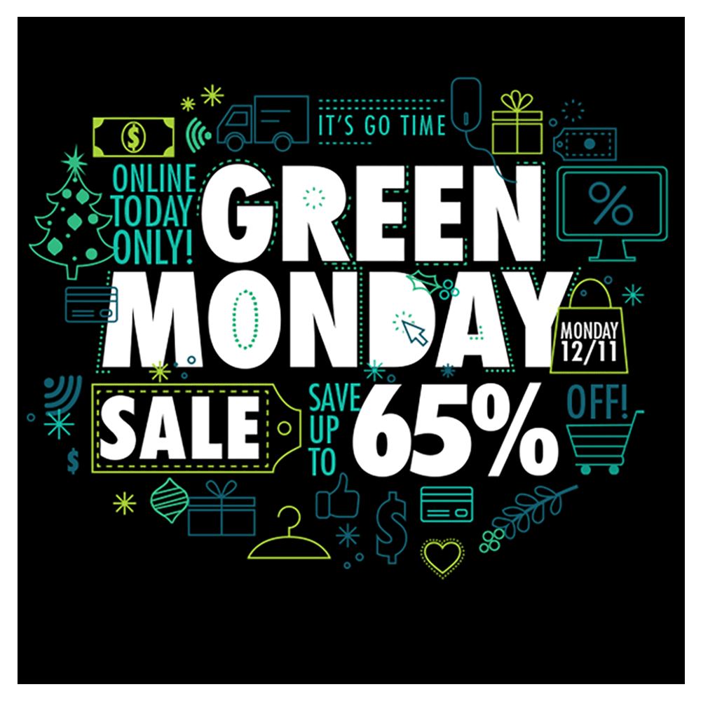
A quick-turn creative challenge with a simple goal: make Green Monday feel anything but generic for Bon-Ton Stores. I designed a quirky, playful graphic that leaned into the unexpected by breaking through the retail noise with bold color, fun illustration, and a wink of personality.
Built to stand out in inboxes and scrolls alike, this visual was used across email and social to support one of the season’s key sale days and drive engagement during one of the season’s most overlooked shopping day.
Deliverables
Email, social post formats
Project
Art Direction, Digital Design, Animation
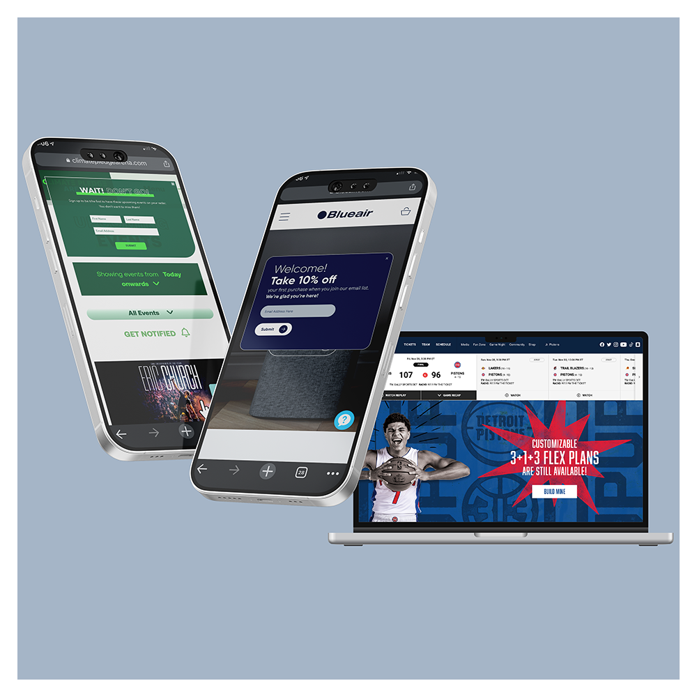
Personalized, On-Brand, and Built to Convert
From hockey arenas to home appliances, I created personalized pop-ups, hero banners and dynamic appointment scheduling for a range of clients including Climate Pledge Arena (home of the Seattle Kraken), Blue Air, Atrium Health and the Detroit Pistons. Each piece was grounded in marketing strategy and built with purpose: drive action through relevant personalization; whether that meant encouraging a purchase, collecting email signups, or highlighting a seasonal promo.
I partnered closely with both marketing and technical consultants to align on data strategy, targeting rules, and user flows, ensuring the right message hit the right audience at the right time. At the same time, I stayed dialed in to brand guidelines and visual consistency, so each experience felt native and seamless across the full site ecosystem.
When strategy, design, and implementation work hand-in-hand, personalization doesn’t feel like a pop-up. It feels like a smart move.
Deliverables
Desktop and Mobile Pop-Ups, Hero Banners
Project
Art Direction, Marketing Strategy, Personalization
Client Roster
Climate Pledge Arena, Detroit Pistons, Rockland National Bank, Atrium Health, Blue Air, NVIDIA
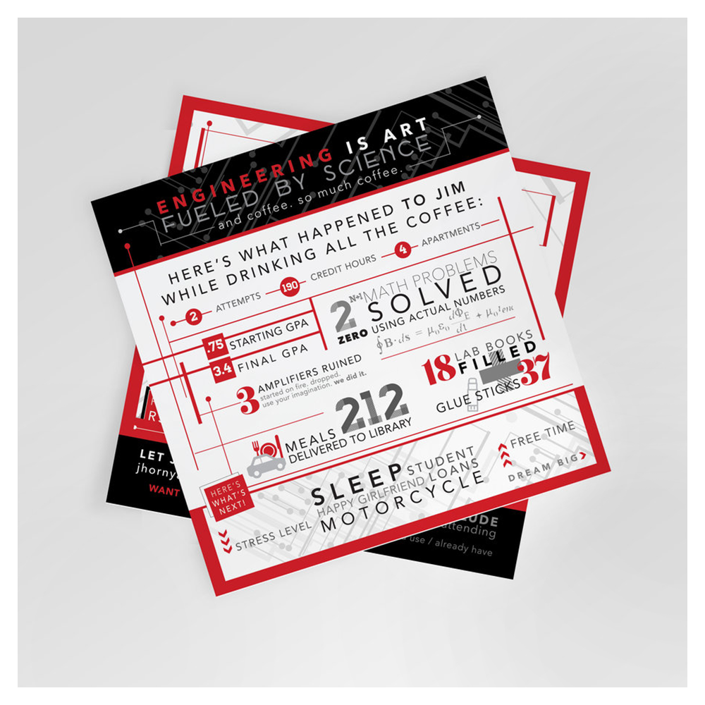
This piece was equal parts celebration and storytelling. Designed as a square 5.5" x 5.5" print, it served as both a graduation invite and a visual timeline summarizing the long, winding road to a Bachelor’s Degree from Milwaukee School of Engineering.
The journey took two tries and ten years, so the goal was to honor every milestone along the way - from personal setbacks to academic wins. I was brought on to transform a complex timeline of life events, data points, and memories into something readable, fun, and emotionally resonant. Visual hierarchy, infographic thinking, and playful tone all came together to help tell a deeply personal and proud story.
Deliverables
Infographic, Printed Invite
Project
Art Direction, Visual Storytelling
A fresh brand for a new salon concept, built from the ground up. I partnered closely with the founder to translate her vision into a visual identity that feels modern, grounded, and scalable, while staying rooted in natural beauty, growth, and movement
Deliverables included a full round of logo exploration that pulled inspiration from plant life, hair extension tools, and the salon experience itself. I provided multiple creative directions that each nodded to the themes of “vera,” leaves, and elegance, both balancing literal interpretations with more abstract forms like silhouettes and negative space.
The final direction incorporated scissors growing into leaf silhouettes which symbolized both the craft and care at the heart of the brand. It was delivered in multiple formats for seamless use across print and digital signage, from in-store applications to social and packaging.
This project reflects a thoughtful and collaborative client process. We stuck closely to our agreed-upon SOW while making room for creative momentum, delivering logos that not only look good in a feed but have legs across all brand touch points.